Pantry Pal
Pantry Pal is a mobile app that streamlines and personalizes the shopping experience by offering advanced filtering options, detailed nutritional information, exclusive deals to incentivize shopping, and a seamless checkout navigation process.
Role
UX Researcher, UX Designer, Product Manager
Tools
Figma, Canva
Duration
August 2024 - December 2024
Grad School Class
Human Computer Interaction
Project Overview
This end-to-end project aims to design Pantry Pal, a mobile app that simplifies and enhances the grocery shopping experience through personalization and intuitive features.
In this project, we identified common challenges faced by shoppers, conducted research through heuristic evaluations, competitive analyses, and participant interviews, and identified strengths, weaknesses, and opportunities for improvement in existing solutions.
Based on our user personas' needs, we created low-fidelity sketches and wireframes, conducted pilot testing, and made iterative adjustments. These refinements informed the development of mid-fidelity wireframes, ultimately leading to a high-fidelity prototype.
Pantry Pal incorporates advanced filtering options, detailed nutritional information, exclusive deals, and seamless checkout navigation to create a user-friendly and efficient shopping experience tailored to its target audience.
Results
Take a peek of the low-fi prototype before you dive into what we discovered in our project.
Design Process
Empathize
Define
Ideate
Prototype
Test
This project focused on an end-to-end project from identifying a problem to creating a low-fi prototype. Key activities included:
Empathize: Conducted user research, competitive analysis, and heuristic evaluations to uncover insights within e-commerce grocery delivering applications.
Define: Defined our persona, problem, and mapped out the user’s experience to identify pain points and area for improvements.
Ideate: Brainstormed, sketched, and began creating story boards to visualize how users would interact with our application.
Prototype: Created a tangible version of Pantry Pal through low-fi and mid-fi prototypes.
Test: Conducted Usability Tests, analyzed feedback and updated our designs based on the feedback.
Empathize
User Research
We conducted interviews with eight Instacart users, ages 23 to 31, to gather insights into their experiences. Many users, like Andrew Parker, expressed frustration with the app's complexity, saying, “I faced numerous frustrations such as unnecessary steps, lack of customization, and confusing navigation.” Bob Jones shared similar concerns, noting, “The app lacked personalized suggestions, filters, and helpful product information, making the process frustrating and unintuitive.”
Key pain points included limited personalization, inconsistent nutrition labels, and poor cart management, highlighting the need for a more intuitive and user-friendly design.
Heuristic Evaluations
Visibility of System Status: We wanted to ensure users are always informed about their actions, such as when items are added to the cart or when checkout is in progress. Clear feedback on the status of these actions helps users feel confident and reduces confusion.
Match Between System and the Real World: We wanted to align the app’s language, layout, and features with real-world shopping expectations, we made the app intuitive. Familiar terms and straightforward navigation, such as simple filtering options and a quick checkout process, create a seamless experience that mimics traditional shopping behaviors, allowing users to easily find and buy products.
Competitive Analysis
As a team, we conducted a competitive analysis of both direct and indirect grocery delivery competitors to identify opportunities for improvement in our product. Here are some key takeaways:
Direct Competitors:
Uber Eats
Pro: Messaging with drivers until delivery.
Con: Limited product information, like nutritional facts and ingredient lists.
Walmart
Pro: Integrates multiple services in one app.
Con: No option to select specific replacement items.
Indirect Competitors:
Hello Fresh
Pro: Simple, minimal interface.
Con: Subscription-based, unlike one-time use apps like Instacart.
DoorDash
Pro: Messaging with drivers until delivery.
Con: Groceries are typically more expensive than in-store prices.
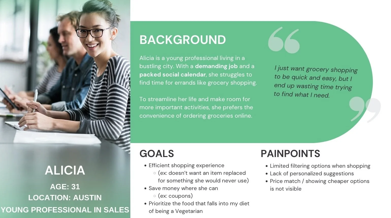
After conducting user interviews, we refined our scope by defining our user persona. Key areas we examined included:
Pain Points: Limited filtering options during shopping, lack of personalized suggestions, difficulty finding price match or cheaper alternatives.
Goals: Achieve an efficient shopping experience (e.g., avoid unwanted replacements, clutter, etc.), save money through features like coupons, prioritize items that align with a specific diet
Define
Ideate
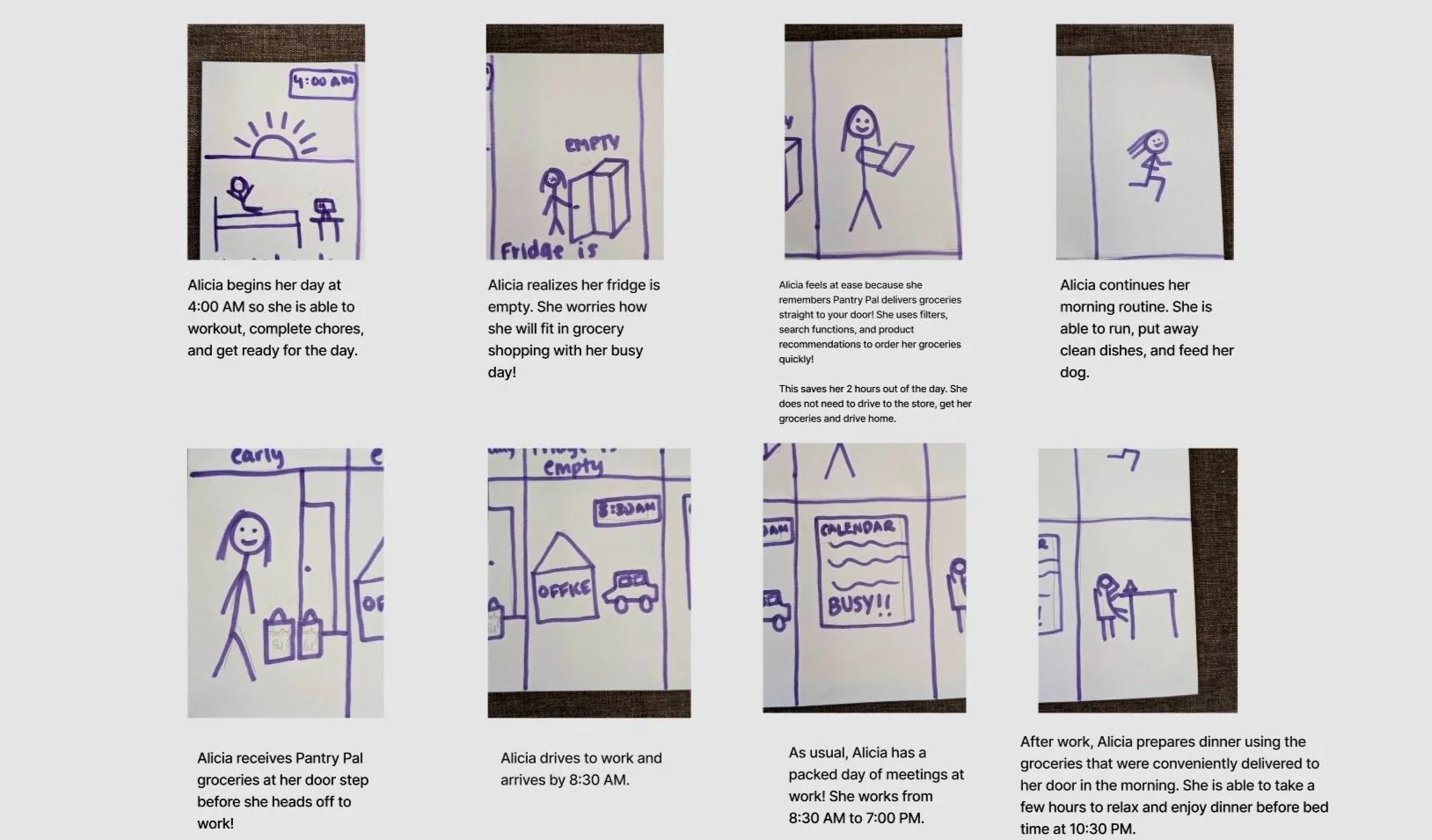
Story Boards
After completing story mapping, the team created a storyboard to outline the needs and subtasks related to a packed schedule leaving little time for grocery shopping. The first two panels highlight the pain points of a busy young professional: a hectic schedule and the inability to find time for grocery shopping. The subsequent panels showcase the advantages of scheduling grocery deliveries in advance.
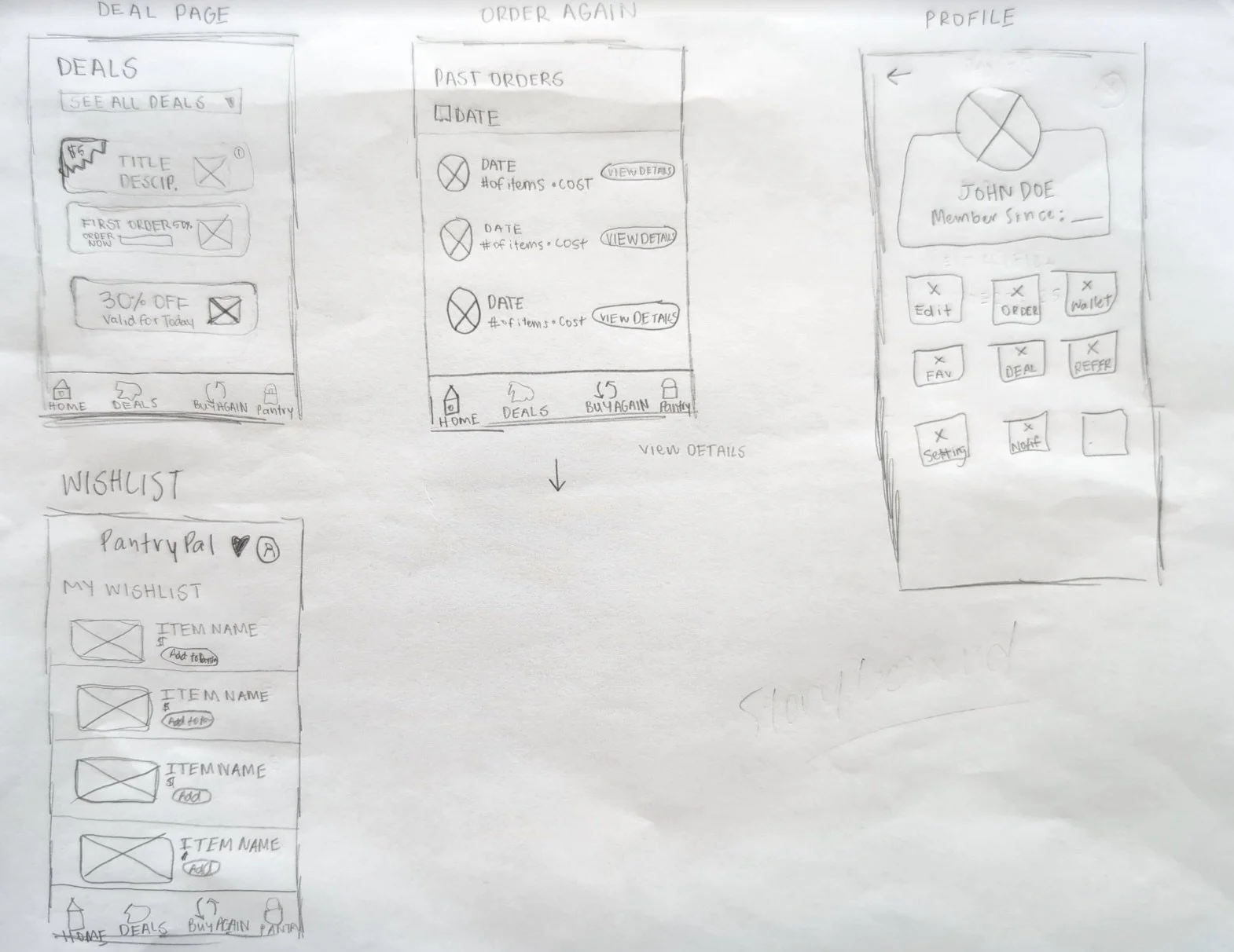
Sketches
We developed low-fidelity paper prototypes for Pantry Pal designed to facilitate convenient online grocery shopping and delivery. Our focus was on creating intuitive task sequences to enhance user experience for both new and returning users.
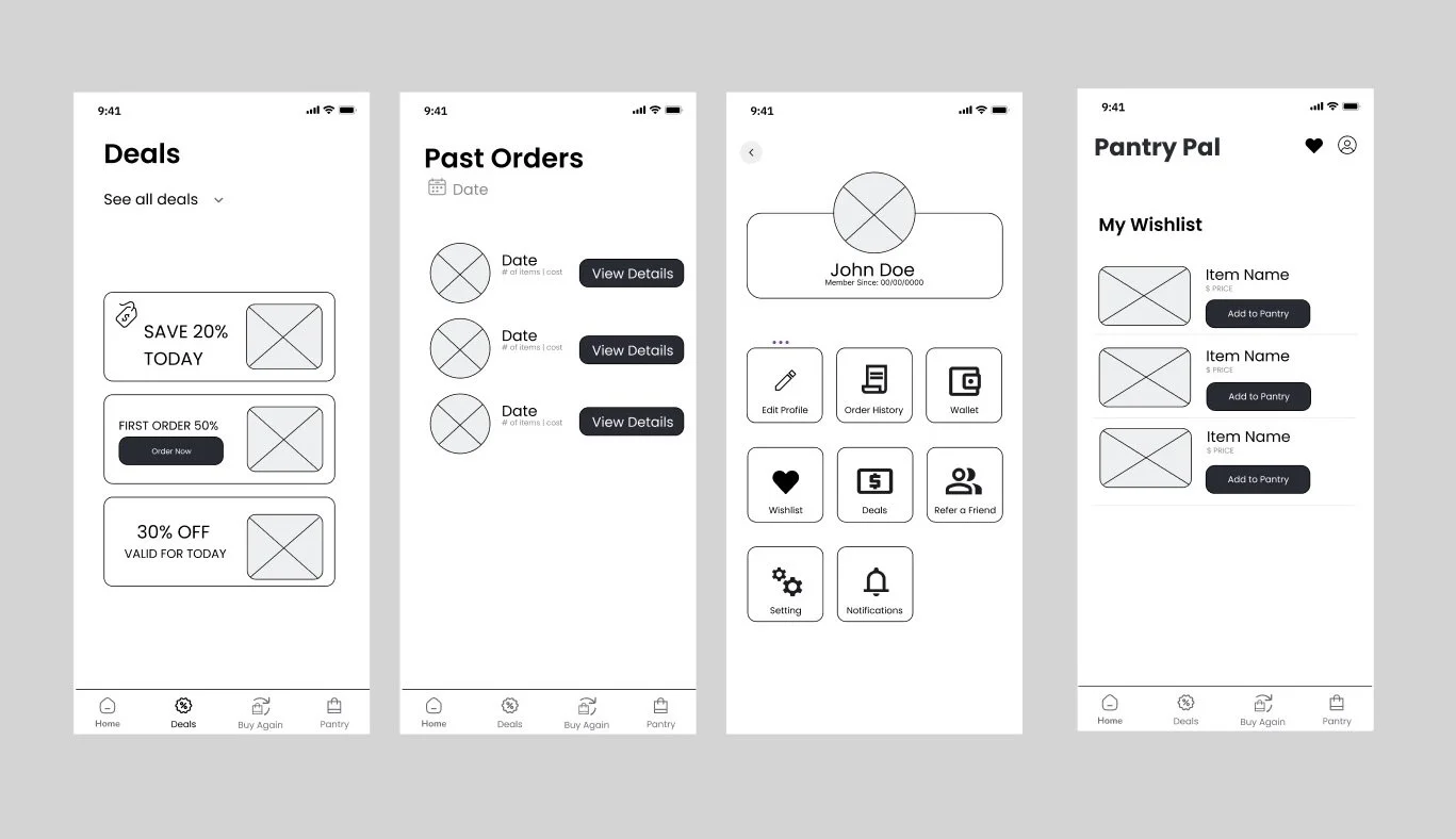
Wireframes
The image to the right demonstrates unique features that Pantry Pal offers to their users. We have a deals page, past orders page, profile page, and a wishlist page.
Prototype
After reviewing our flow diagrams and low-fidelity wireframes, we decided to narrow our scope by designing key tasks for users navigating the grocery shopping experience, from account setup to tracking their delivery:
New users completing the Sign-Up process by entering essential information (email/phone and password) with optional food preferences
Returning users logging in and navigating to the Home Page, where they can quickly search for items or browse by category/ store.
Browsing and selection features through pages like the Deals Page and Wishlist, supporting item discovery and personalized shopping
Checkout flow, covering Delivery Options, Checkout screens, Confirmation Page, and Delivery Tracker, which includes real-time updates on delivery status
We focused on these tasks to streamline the user journey and emphasize an intuitive and simple shopping and delivery experience. Deciding against additional flows, allowed us to center the prototype on a clear, efficient user path through essential grocery delivery interactions.

Test
We ran six pilot tests to troubleshoot our low-fi prototype. Here were some key takeaways:
Clarify button labels & navigation: Users sometimes expected action X but got Z instead, and some tasks required multiple clicks instead of one click.
Consistency: Users noticed differences between screens and flows that interrupted their seamless process.
Refine “Pantry” navigation: Users recommended to change the language of “Pantry” to “Checkout” or “Cart” to reduce confusion however, with our brand, we feel it is best to lean into the name of Pantry.
My Learnings
Communication is Key: Two-week sprints are intense, making open and consistent communication with my project team was essential for meeting deadlines and delivering a high-quality product.
Early User Feedback is Crucial: Pilot testing and having another project team explore our app provided invaluable insights into what was needed and how to improve the product. In hindsight, we wish we would have sought this feedback earlier in the process.
Leadership Opportunities: Taking initiative and delegating tasks effectively creates a more organized workflow and enhances project quality. Embracing leadership roles fosters better collaboration, efficiency, and overall team success.