Costco Analysis
A comprehensive usability and accessibility evaluation of the Costco app and website conducted as part of my UX design coursework.
Role
UX Researcher, UX Designer, Accessible UX
Tools
Figma, WCAG
Duration
August 2024 - December 2024
Grad School Class
Usability and Accessibility
Project Overview
This project aims to comprehensively evaluate the usability and accessibility of the Costco mobile app, focusing on the user experience from login to transaction completion.
By conducting heuristic evaluations, competitive analyses, and participant interviews, we identified strengths, weaknesses, and areas for improvement in the app's design and functionality. This Costco app evaluation enhances the overall user experience and optimize the app for its target audience.
Design Process
Empathize
Define
Ideate
Prototype
Test
This project focused on research and analysis to evaluate the usability of the Costco app. Key activities included:
Heuristic Evaluation: Assessed the app against established usability principles to identify areas for improvement.
Competitive Analysis: Compared the Costco app to similar platforms to understand industry standards and best practices.
Participant Interviews: Conducted user interviews to gather insights into real-world experiences and challenges.
Recommendations: Synthesized findings to provide actionable suggestions for improving the user experience.
This research-driven approach aimed to help Costco deliver a more seamless and positive experience for its users.
A Quick Snapshot of the Costco App
Heuristic Evaluation
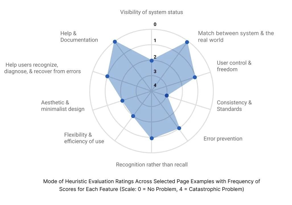
We conducted a heuristic evaluation to identify the strengths and weaknesses of the Costco app. The most critical issues:
Flexibility and Efficiency of Use
Consistency
However, the app performed well in areas such as recognition rather than recall and alignment with real-world expectations. Building on these insights, we expanded our research to examine both direct and indirect competitors, aiming to further inform our design recommendations
Competitive Analysis
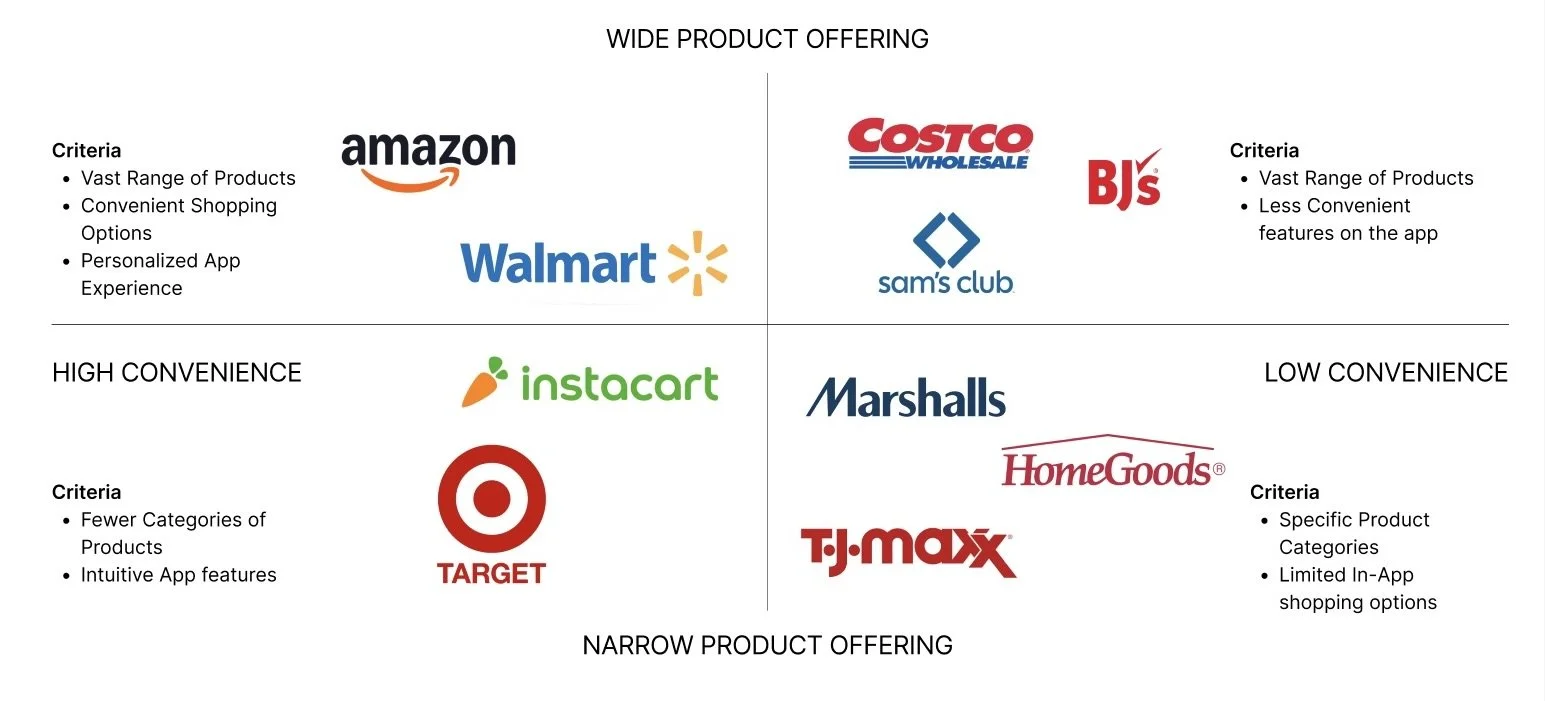
We conducted a competitive analysis, comparing Costco’s app with both direct and indirect competitors to evaluate their features and user flows. Using our heuristic findings as a guide, we identified the strengths and weaknesses of each competitor. Key areas we examined included:
Convenience of the search experience
Comprehensiveness and ease of use of filters
Intuitiveness and personalization of the home page
Design elements maintained a cohesive and user-friendly style.
Research Design
Recruitment
Created a screener with 15 qualifying questions to assist in selecting the participants for the interviews. Participants included:
Six participants
Ages 25-35
Varied in occupation and gender
Research Methods
The study was divided into three sections:
Pre-test questions to build rapport and gather context (4 warm-up and 3 behavioral questions)
Core tasks to explore key user flows in the Costco app (6 tasks)
Post-test questions to evaluate the app’s effectiveness and gather final feedback (8 questions).
Session Structure
Participants were asked to think aloud, sharing their thoughts while completing tasks. They downloaded the Costco app beforehand and shared their screens during the session. Each session had a moderator and a notetaker.
Tasks & Performance Overview
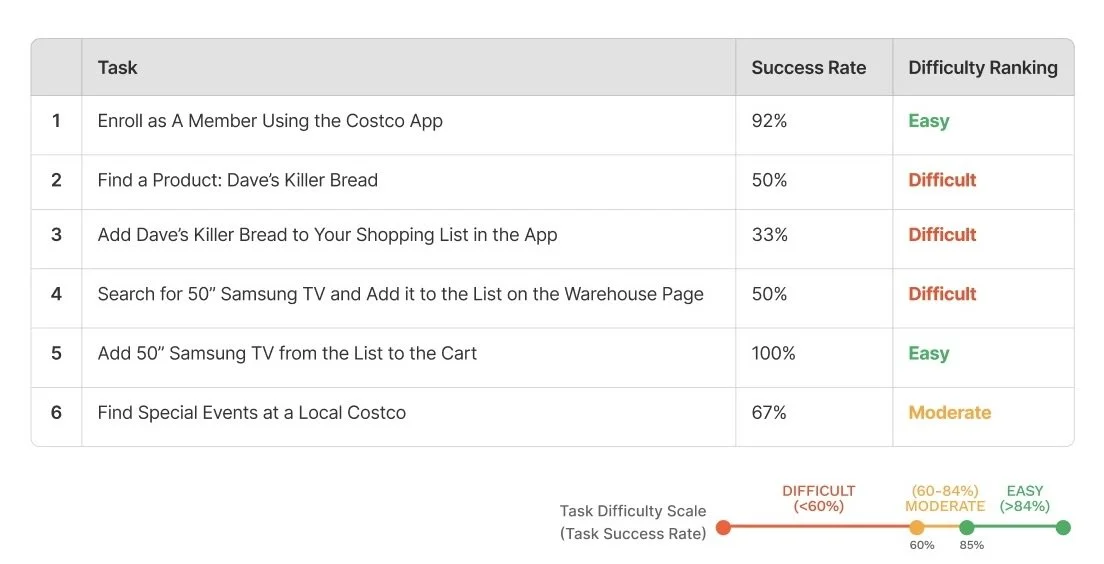
Participants completed six key tasks in the Costco app, including:
Enrolling as a member
Finding and adding items to the shopping list or cart
Searching for special events at a local Costco
Each task was assigned a difficulty level: easy, moderate, or difficult. Our results revealed areas for improvement, guiding recommendations to enhance usability.
Recommendations
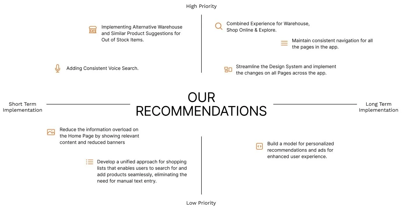
Recommendations were categorized by timeline (short-term vs. long-term) and priority (low vs. high) to guide strategic planning. For maximum impact, we believe it is best to focus on:
Combined Experience for Warehouse, Shop Online, & Explore
Maintain Consistent Navigation for all the pages in the app
Streamline the design system and implement the changes on all pages across the app
My Learnings
Strength in Research: Working directly with participants reinforced the importance of human-centered design and my ability to uncover meaningful insights through user research.
Avoiding Bias: Tight deadlines can create challenges, such as insufficient effort in sourcing a truly diverse participant group. Planning ahead and allocating time for participant recruitment can reduce this issue.
Leadership Opportunities: Taking initiative and assigning tasks to team members ensures a more organized workflow and can improve the overall quality of the project. Embracing leadership roles leads to better collaboration and efficiency.
